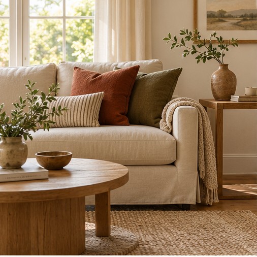
Cream paint can look pink beside a beige sofa or yellow beside an oak floor. Use those existing colors to choose a warm neutral scheme, and view each paint sample beside them.
Start with what is staying
Before choosing a new paint color, look at the largest surfaces you already have: flooring, a sofa, curtains, and wood furniture. These pieces set the room’s starting point. A beige sofa may lean pink, while a wood floor may lean golden. Place possible colors beside those surfaces rather than judging them against a white screen.
For a room with golden oak flooring, try a soft cream background, linen-colored upholstery, and a small olive accent. If the room already has a pinkish beige sofa, compare warmer taupes and muted terracotta beside it. Put the samples together on the sofa before deciding; each color changes how its neighbor looks.
Test in the room’s real light
Compare physical samples at different times of day. Look at them near a window and in a darker corner, then again under the lamps you use at night. If you are testing paint, use the manufacturer’s recommended sampling method. A sample board can help you compare positions without committing to an entire wall.
Add texture before adding more colors
A room with similar tones can still have variety. Pair smooth ceramics with woven baskets, cotton with a textured throw, or finished wood with a soft rug. Keep practical needs in mind: a delicate pale fabric may not suit a busy eating area. Try one change at a time; more layers do not automatically make a room more comfortable.
Test the combination beside the sofa
Borrow a cushion, throw, or ceramic piece from another room. Set them beside the largest item of furniture, then remove one at a time. If the scheme only works when every accessory is present, simplify it before spending money. A rug or curtain has more influence than a small vase, so settle the larger pieces first.
Check the room from the entrance, where you see the walls, floor, and furniture together. If everything merges into one pale block, add contrast with an existing wood piece, darker cushion, or textured rug. Keep the colors you enjoy living with, even when they do not match a reference photo.
Leave a Reply